Utilisation reports by project, department and week
A utilisation report shows what share of your team's expected hours went into logged work, and where those hours went. PeopleMuster builds it from the daily timesheets, on a screen the app calls Utilization reporting. For a sense of scale, Deltek's Clarity study of architecture and engineering firms (12 May 2026) put staff utilisation at just under 60%. Reading yours weekly is what stops a quarter ending in a surprise.
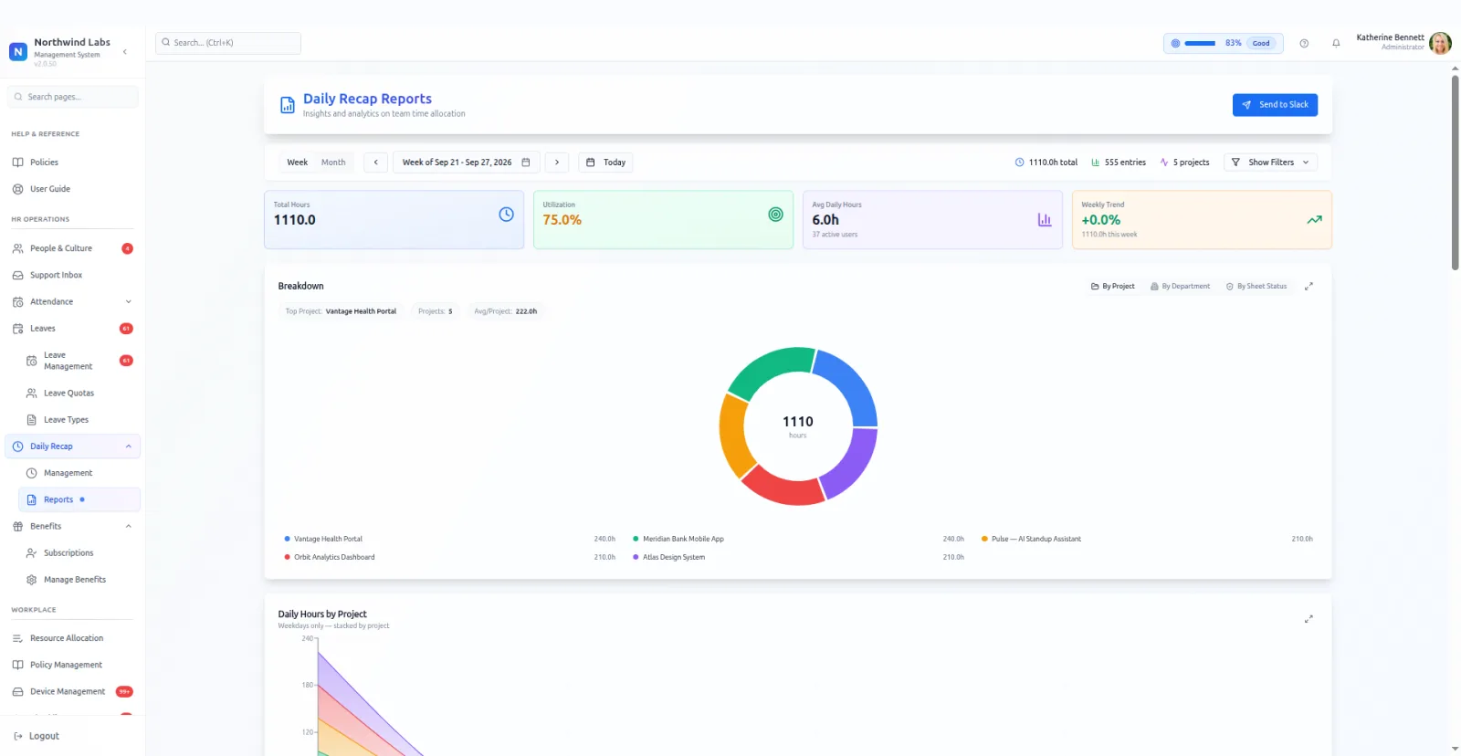
The headline numbers are total hours, utilisation percentage and average hours per day. A weekly trend line sits beside them, because the direction matters more than any single week's figure.
Breakdowns slice the same hours three ways: by project, by department, and by sheet status. Sheet status is the one people forget, and it tells you how much of the total is still unapproved and therefore still soft.
A stacked daily chart shows where a week's effort went, project by project. A distribution view shows how hours cluster. Week-over-week puts two periods side by side without exporting anything.
There is a team leaderboard, and a send-to-Slack action that drops the report into a channel on demand. Teams that post it every Monday stop having the conversation about whether anyone reads it.
The department view is the one that surprises people. Hours rarely sit where the org chart implies, and a design team carrying a third of its load on one account is the sort of thing nobody reports and everybody feels.
Averages hide as much as they show. A team at seventy percent might be four people at seventy, or two at ninety-five and two at forty-five. The distribution view exists for exactly that, and checking it before acting on the headline is a good habit.
Utilisation is a number somebody has to look at. A report you open every Monday catches a slide early, while one that only gets opened during a bad quarter arrives too late to help.
Read the team leaderboard as a completeness check rather than a productivity score. The person at the bottom is usually the person who has not filled in their week.
Reading the trend before the number is the habit worth building. Seventy percent on its own says very little. Seventy after three weeks at eighty-five says a great deal, and the weekly line is where that shows.
Posting to Slack changes who sees it. A report that lives behind a login gets read by the person who ran it. A report in a channel gets read by everyone who could act on it, which is the point of collecting the hours in the first place.
What it does
- Utilisation percentage
- One figure per period, with average daily hours and the total beside it.
- Three breakdowns
- By project, by department, and by sheet status so you know how much is still unapproved.
- Week-over-week
- Two periods compared in place. The trend answers questions a single number cannot.
- Post to Slack
- Send the report into a channel from the page, instead of exporting and pasting.
- Distribution view
- How hours cluster across the team, so an average cannot hide two opposite problems.
What it needs before it works
- Timesheets in use and, ideally, approved. Utilisation calculated on drafts is a guess.
- Projects and departments set up properly, since both breakdowns group by them.
- The Slack integration connected, if you want the report posted rather than opened.
Questions people ask
What goes into a utilization report?
Total hours, a utilisation percentage and average daily hours for the period you pick. PeopleMuster splits the same hours by project, by department and by sheet status. A weekly trend and a week-over-week view sit beside the headline figure.
Where do the hours come from?
From the same daily timesheets people already fill in. There is no second system to reconcile, and the sheet-status split shows how much is approved.
Can the report go out automatically?
The page has a send-to-Slack action, and the notification scheduler can post recurring reminders to a channel. Both need the Slack integration connected first.
Why does my utilisation figure look low?
Usually unapproved sheets. Split the view by sheet status and compare approved against draft before you read anything into the headline.
What period does the report cover?
Whatever range you choose. The weekly trend and the week-over-week comparison are the two views most teams settle on, because a single week rarely means much on its own.
Should I act on a team average?
Check the distribution first. A team average of seventy percent can hide two people at ninety-five and two at forty-five, which is a different problem with a different answer.